Logo
Colour Palette
#b900d4
#000000
#ffffff
Font(s)
Arial Black
My Purple Earth – Brand Identity
This branding project was created for My Purple Earth, a creative-first music platform with a mission to make the industry more accessible, transparent, and artist-empowered. The goal was to establish a strong, memorable identity that reflects the company’s values—creativity, sustainability, and positive transformation.
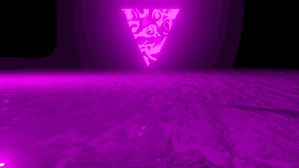
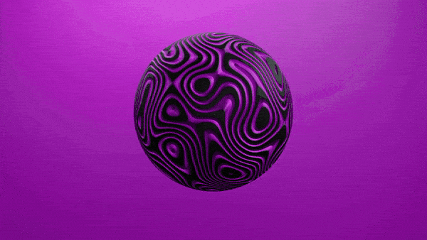
At the heart of the brand is a distinctive shade of purple, carefully chosen for its uplifting and inquisitive nature. Scientifically, this particular hue sits between red’s energy and blue’s stability, often associated with imagination, transformation, and forward-thinking—qualities that align closely with the ethos of My Purple Earth.
The logo is a simple yet effective depiction of a purple earth, directly referencing the brand name while symbolizing its commitment to global creative impact and eco-conscious values. This minimalist approach supports the platform’s straightforward goals: to offer everything a traditional label provides—publishing, distribution, monetization, and more—without the exploitation.
The final identity is clean, warm, and instantly recognizable, designed to be approachable for independent artists and scalable across digital and physical experiences. It reinforces My Purple Earth’s role as both a trusted platform and a movement for meaningful, sustainable change in the music industry.
Interested in our Brand Design, Graphic Design services?
Check out some more examples of our Brand Design, Graphic Design work below, or book in now:
My Purple Earth – Brand Identity
Logo
Colour Palette
#b900d4
#000000
#ffffff
Font(s)
Arial Black
This branding project was created for My Purple Earth, a creative-first music platform with a mission to make the industry more accessible, transparent, and artist-empowered. The goal was to establish a strong, memorable identity that reflects the company’s values—creativity, sustainability, and positive transformation.
At the heart of the brand is a distinctive shade of purple, carefully chosen for its uplifting and inquisitive nature. Scientifically, this particular hue sits between red’s energy and blue’s stability, often associated with imagination, transformation, and forward-thinking—qualities that align closely with the ethos of My Purple Earth.
The logo is a simple yet effective depiction of a purple earth, directly referencing the brand name while symbolizing its commitment to global creative impact and eco-conscious values. This minimalist approach supports the platform’s straightforward goals: to offer everything a traditional label provides—publishing, distribution, monetization, and more—without the exploitation.
The final identity is clean, warm, and instantly recognizable, designed to be approachable for independent artists and scalable across digital and physical experiences. It reinforces My Purple Earth’s role as both a trusted platform and a movement for meaningful, sustainable change in the music industry.
Interested in our Brand Design, Graphic Design services?
Check out some more examples of our Brand Design, Graphic Design work below, or book in now: